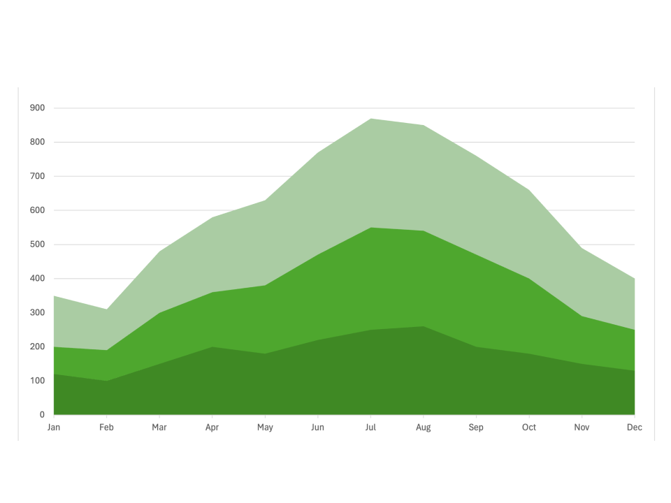
Simple Stacked Area Chart
What is a Stacked Area Chart
-
A stacked area chart is a data visualization tool that represents the cumulative contribution of multiple data series over time or categories. It consists of multiple layers, each representing a data series, stacked on top of each other to show their cumulative effect. The vertical axis usually represents the values, while the horizontal axis typically represents time or categories. The space between each layer indicates the size of each data series.
-
The primary difference between a stacked area chart and other charts, such as line charts or regular area charts, is the cumulative stacking of data. This unique feature allows stacked area charts to effectively show the relative and absolute contributions of each data series to the total, making it easier to understand trends and relationships among the different series.
Applications of Stacked Area Charts
Financial Performance Analysis
- Stacked area charts are often used to analyze financial performance over time. For example, a company might use a stacked area chart to visualize the contribution of different revenue streams to the total revenue, allowing them to see which streams have the most significant impact over time.
Website Traffic Analysis
- In web analytics, stacked area charts help monitor website traffic sources. A digital marketing team can use a stacked area chart to compare the contributions of organic search, direct traffic, social media, and referral traffic to the total website visits, helping identify trends in traffic sources over time.
Energy Consumption Breakdown
- Stacked area charts can also visualize energy consumption breakdowns. For instance, an energy company could use this chart to show the proportion of energy consumption from different sources like coal, natural gas, solar, and wind over several years, highlighting shifts in energy use.
Market Share Analysis
- In market research, stacked area charts help compare market shares of different products or brands over time. For example, a market analyst can use a stacked area chart to see how the market share of various tech companies has evolved in the smartphone industry, showing both individual and total market changes.
Stacked area charts provide a powerful way to visualize cumulative data across multiple series, making them ideal for financial performance analysis, web analytics, energy consumption breakdowns, and market share analysis. Their ability to show total and relative contributions provides valuable insights into data trends and patterns.
