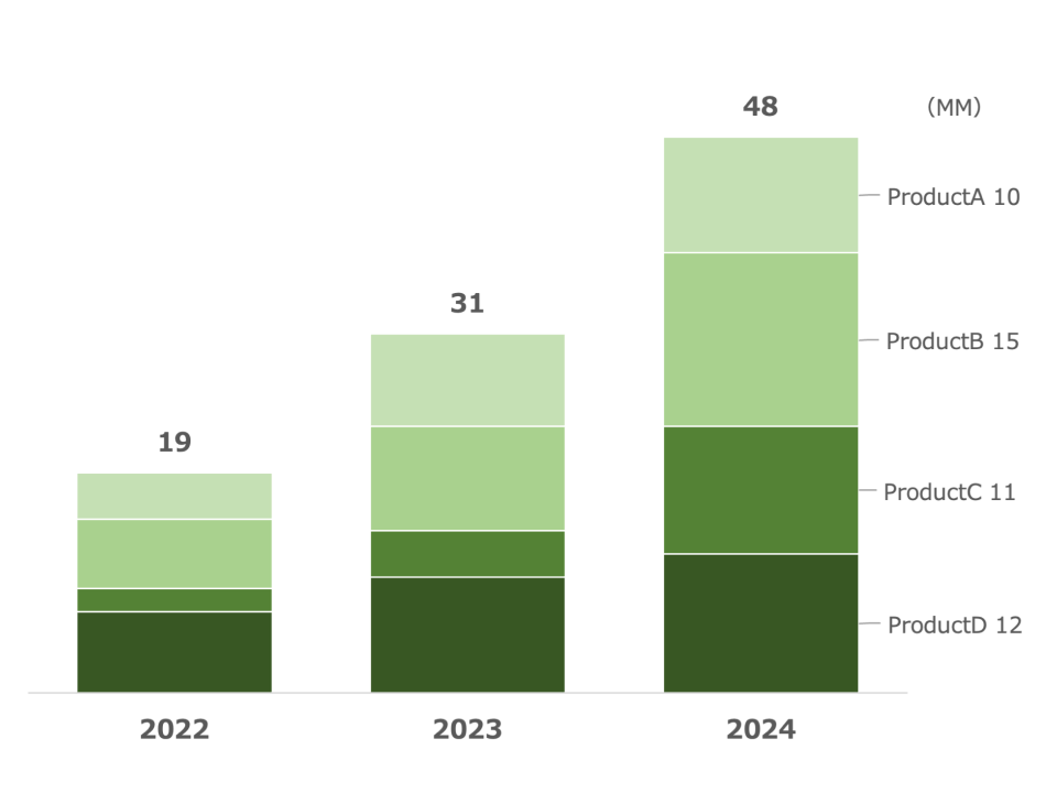
Simple Stacked Bar Chart
What is a Stacked Bar Chart
-
A stacked bar chart is a type of bar chart that represents multiple data series stacked on top of each other within the same bar. Each bar represents a total value, with segments indicating the contribution of each individual data series to the total. The segments’ heights or lengths depend on the value they represent, showing the cumulative effect across the series.
-
The main difference between stacked bar charts and other bar charts is the ability to show the total value while simultaneously breaking down contributions by categories. This unique feature allows for the visualization of both the whole and its parts in one chart, making it easier to see how individual components contribute to the total.
Applications of Stacked Bar Charts
Budget Allocation
- Stacked bar charts are often used in budget analysis to show the allocation of funds across different categories over time. For example, a non-profit organization might use a stacked bar chart to show the breakdown of funding for different projects each year, revealing how much was allocated to education, health, and infrastructure.
Sales Analysis
- In business, stacked bar charts can be used to analyze sales data across different regions or product lines. A company can use this chart to see the total sales of each product line, while also comparing the contribution of each region to those totals.
Market Share Comparison
- Stacked bar charts can help illustrate market share distribution across multiple companies and product lines. For instance, a tech company might use a stacked bar chart to show the market share of different software products, allowing them to visualize their overall position in the industry.
Employee Distribution
- In HR, stacked bar charts are useful for analyzing employee distribution across different departments and roles. For example, a company might use a stacked bar chart to show the distribution of employees by department, while also breaking down the data by job role within each department.
Stacked bar charts provide a powerful way to visualize data, making them useful for analyzing budgets, sales, market shares, and employee distribution. Their unique ability to show both total values and category contributions helps organizations understand the data and make informed decisions.
