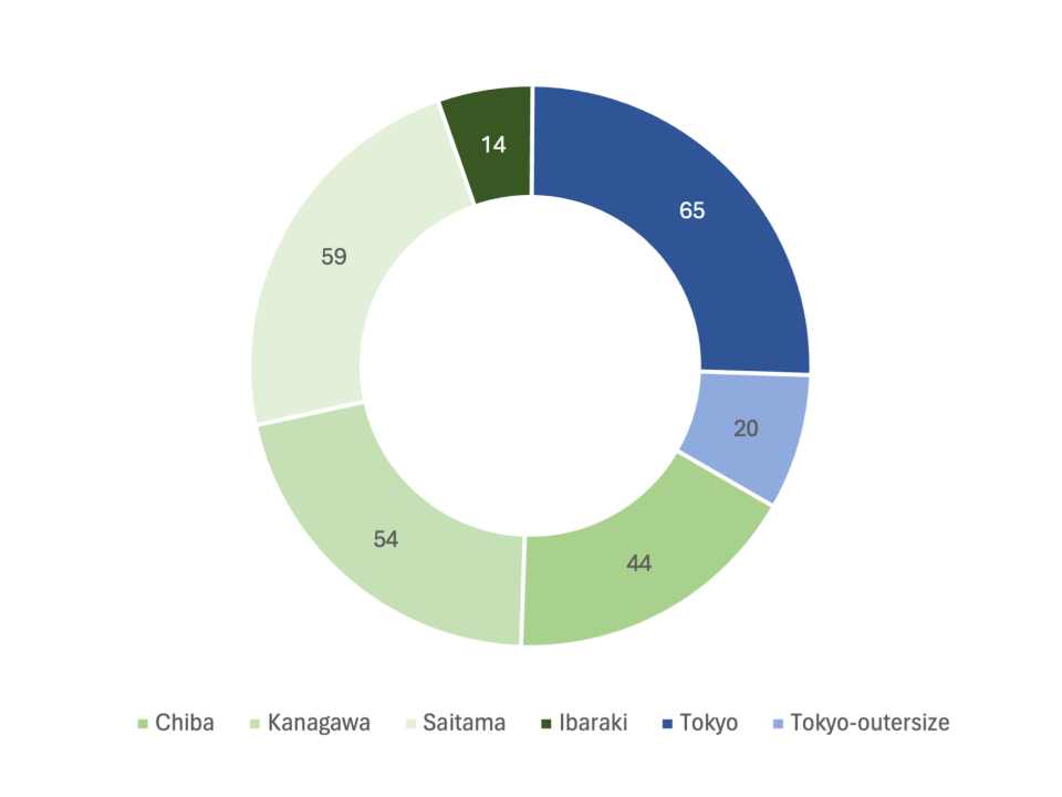
Simple Donut Chart
What is a Donut Chart
-
A donut chart, sometimes referred to as a doughnut chart, is a type of pie chart that represents data in the form of a circular ring. Unlike traditional pie charts, the center of a donut chart is hollow, which creates a ring-like appearance. The chart is divided into slices, with each slice representing a category’s proportion to the total dataset. The size of each slice indicates the relative percentage or proportion of the category it represents.
-
The primary difference between a donut chart and other charts, such as pie charts, lies in its hollow center. This unique feature provides space for labels, data values, or percentages inside the chart, offering a cleaner and more visually appealing presentation. Additionally, the hollow center can be used to display summary information or additional data insights.
Applications of Donut Charts
Market Share Distribution
- Donut charts are frequently used to visualize market share distribution among competitors. For instance, a business can use a donut chart to display the percentage of the market each competitor holds, with each slice representing a different company.
Budget Allocation Analysis
- Companies often use donut charts to analyze budget allocation across various departments or projects. For example, a finance team might present a donut chart to show the proportion of the total budget allocated to marketing, sales, research and development, and other departments.
Customer Demographics Breakdown
- Donut charts are useful for visualizing customer demographics. For example, a company can create a donut chart to display the age distribution of its customers, with each slice representing a specific age group.
Product Sales Comparison
- Donut charts are also effective in comparing the sales proportions of different product categories. For instance, a retail business can use a donut chart to show the relative sales percentages of its clothing, electronics, and home goods departments.
Donut charts offer a visually engaging way to represent proportional data across a variety of applications, from business analytics to demographic studies. Their distinctive design makes them suitable for showcasing percentages and distributions in an aesthetically pleasing manner.
