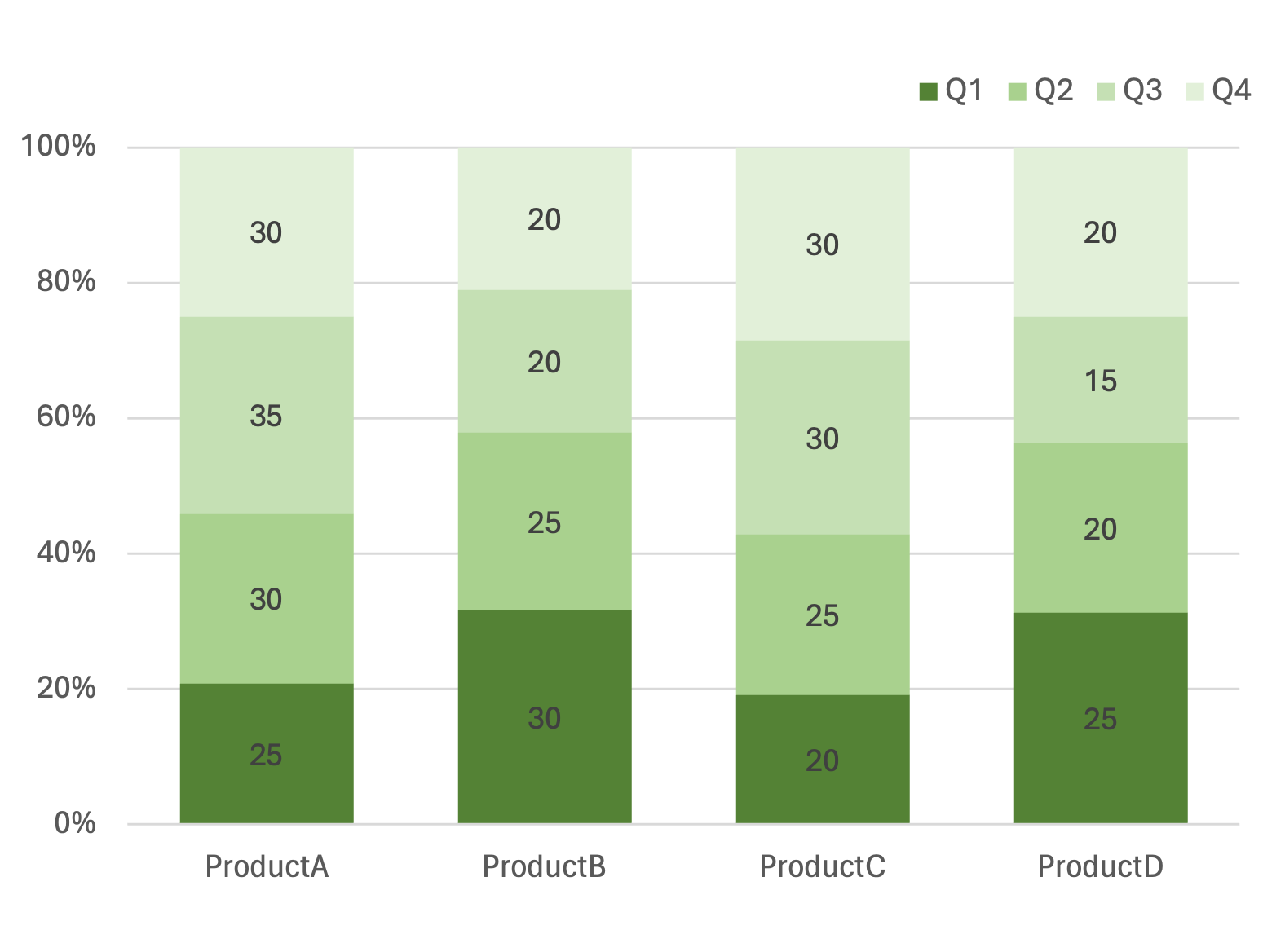
Simple 100 Percent Bar Chart
What is a 100 Percent Bar Chart
-
A 100 percent bar chart, also known as a 100% stacked bar chart, is a type of chart that shows the relative proportions of multiple categories, where each bar represents a total of 100%. The bars are divided into segments, each representing a percentage of the whole, allowing viewers to compare the composition of different groups. Each bar’s height is the same, but the width of each segment differs based on its proportion in that group.
-
The key difference between a 100 percent bar chart and other bar charts is its focus on proportional representation rather than absolute values. Unlike standard stacked bar charts, where bars can vary in height based on total value, all bars in a 100 percent bar chart are the same height, emphasizing the percentage distribution within each bar. This unique feature makes it easier to compare the composition of various data sets side by side.
Applications of 100 Percent Bar Charts
Customer Demographics
- A 100 percent bar chart can be used to visualize customer demographics. For example, a company can use this chart to compare the proportion of customer segments based on age groups across different regions, helping to identify which regions have the most balanced demographic distribution.
Product Market Share
- In business analysis, a 100 percent bar chart can illustrate market share distribution across different product lines. For instance, a tech company can visualize the percentage breakdown of sales among its product lines across various countries, providing insights into which products dominate specific markets.
Employee Role Distribution
- Companies can use 100 percent bar charts to analyze employee role distribution across departments. For example, an organization can compare the distribution of roles, such as managers, engineers, and administrative staff, across multiple departments to identify imbalances or over-representation.
Budget Allocation
- In financial analysis, a 100 percent bar chart can help visualize budget allocation across different departments. For instance, a non-profit organization could use this chart to show the proportion of spending allocated to different initiatives over several years, providing insights into changing funding priorities.
100 percent bar charts offer a clear way to understand proportional data across various groups, making them invaluable for visualizing customer demographics, market share, employee roles, and budget allocation. Their focus on percentage distribution provides valuable insights into the relative importance of data categories.
