Pie of Pie Chart
What is a Pie of Pie Chart
-
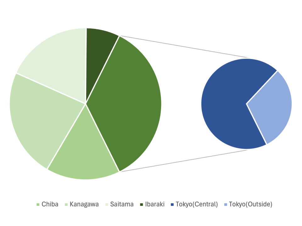
A pie of pie chart is a specialized type of pie chart that enhances the visual representation of data by breaking down one segment of the main pie chart into a smaller, secondary pie chart. This helps to better understand the distribution of subcategories within that segment. The primary pie chart provides an overview of the entire dataset, while the secondary pie chart provides a deeper look into a specific segment that may contain too many subcategories to show clearly in the main chart.
-
The primary difference between a pie of pie chart and other charts is the ability to offer a high-level overview and a detailed view in one visual. This unique feature is particularly helpful when there are multiple subcategories within a single segment, as the secondary pie chart provides a more granular breakdown without cluttering the main chart.
Applications of Pie of Pie Charts
Expense Breakdown
- A pie of pie chart is useful for breaking down complex expenses in a financial analysis. For example, the main pie chart might show overall company expenses, with one segment representing marketing costs. The secondary pie chart can then break down marketing expenses into subcategories such as digital marketing, print ads, and TV commercials.
Sales Revenue Analysis
- In sales analysis, a pie of pie chart can help in understanding the revenue distribution across multiple categories. The main pie chart could display total revenue across different regions, with the secondary pie chart breaking down the revenue distribution for a specific region into subcategories like product lines or customer segments.
Customer Demographics Visualization
- In demographic studies, pie of pie charts can help visualize customer demographics. For instance, the main pie chart can show the percentage of customers by age group, while the secondary pie chart breaks down a specific age group into subcategories like income levels or education.
Marketing Budget Allocation
- Marketing departments can use pie of pie charts to understand budget allocation in more detail. The main pie chart might show the overall budget allocated across marketing channels, while the secondary pie chart shows a detailed breakdown of the digital marketing budget into specific online platforms like social media, search ads, and display ads.
Pie of pie charts provide a powerful way to visualize data, offering both a high-level overview and detailed breakdowns of specific segments. This allows businesses to better understand complex datasets in areas such as finance, sales, marketing, and demographics.