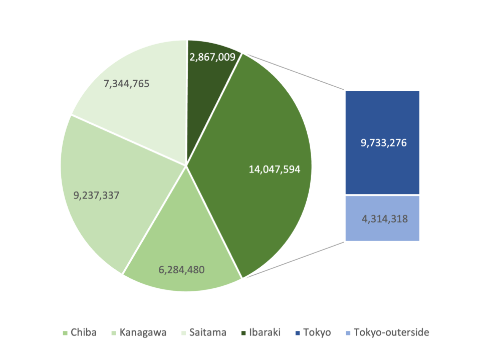
Pie Chart with Subsidiary Bar
What is a Pie Chart with Subsidiary Bar
-
A pie chart with subsidiary bar is a type of data visualization that combines the classic pie chart’s circular representation with an adjacent bar chart. The pie chart represents the main categories or overall data distribution, while the subsidiary bar chart provides additional detail about the data. For example, each slice of the pie chart can represent a specific category, and the bar chart next to it shows a breakdown of the data within that category.
-
The main difference between a pie chart with a subsidiary bar and other charts is the ability to provide a high-level overview with detailed insights in a single visual. This unique feature allows for easy comparison of overall data distribution and in-depth analysis of specific segments without overwhelming the viewer with too much data in one place.
Applications of Pie Charts with Subsidiary Bar
Marketing Campaign Analysis
- Marketers can use a pie chart with a subsidiary bar to understand the distribution of a marketing budget across channels and then use the subsidiary bar chart to dive deeper into the specific allocations. For example, the pie chart can show the budget split among digital, print, and TV ads, while the subsidiary bar chart breaks down digital ads into social media, search engine marketing, and display ads.
Product Sales Distribution
- Companies can use this chart type to analyze sales data. The pie chart can show the percentage of total sales for each product category, while the subsidiary bar chart provides detailed sales information for individual products within a category. For example, the pie chart might show the share of sales for electronics, clothing, and furniture, while the bar chart details sales by product within electronics.
Customer Demographics Analysis
- In customer demographics, a pie chart with a subsidiary bar helps in understanding customer segments. The pie chart can represent the overall customer age groups, while the subsidiary bar chart provides insight into income levels, education, or location for each age group. For example, the pie chart might show age distribution, while the bar chart details income ranges within the 18-24 age group.
Financial Data Overview
- Financial analysts use this chart type to present a comprehensive view of a company’s financial status. The pie chart can show revenue distribution across different business segments, and the subsidiary bar chart gives a detailed breakdown of expenses or profit margins within those segments.
A pie chart with a subsidiary bar provides a powerful way to visualize data, offering both high-level and detailed insights. This allows businesses to gain a deeper understanding of their data in marketing, sales, customer demographics, and financial analysis.
