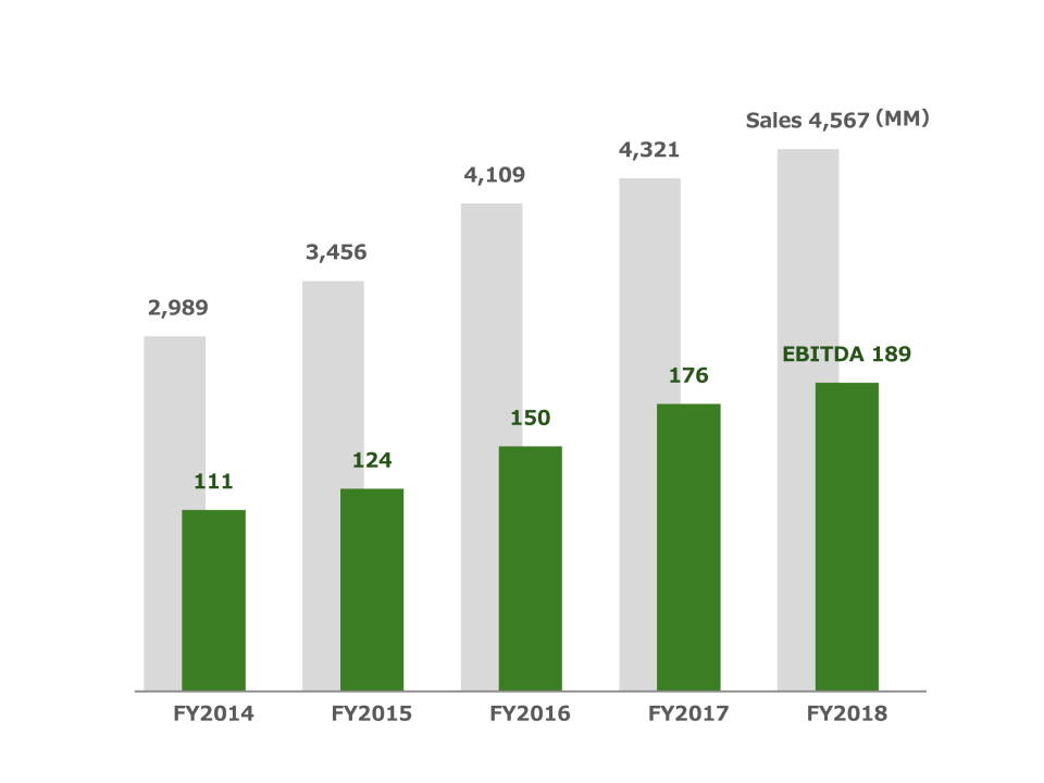
Multiple Column Chart
What is a Multiple Column Chart
-
A multiple column chart, also known as a clustered column chart, is a type of bar chart that allows for the comparison of different data sets across multiple categories. Each category is represented on the horizontal axis, and within each category, multiple columns represent different data sets. The height of the columns indicates the values for each dataset, enabling easy comparison across categories and datasets.
-
The difference between a multiple column chart and other charts is its ability to display multiple data sets side-by-side within the same category, making comparisons clearer. Unlike simple bar charts that show one data set per category, multiple column charts allow for a more detailed analysis of comparisons. This chart is unique in its capacity to provide a detailed comparison of data across various dimensions in a single view.
Applications of Multiple Column Charts
Sales Performance Analysis
- Multiple column charts are often used to analyze sales performance across different regions or product lines. For example, a company can use a multiple column chart to compare quarterly sales data across various regions, with each region having columns for different product lines.
Budget Allocation Comparison
- Finance departments use multiple column charts to compare budget allocations for different departments or projects across multiple years. For instance, a finance team could use a multiple column chart to compare annual budget allocations for marketing, sales, and research over the past three years.
Academic Performance Comparison
- In education, multiple column charts help visualize student performance across different subjects and terms. For example, a school can use a multiple column chart to compare the average grades of students in math, science, and language arts for each semester.
Customer Satisfaction Analysis
- Businesses often use multiple column charts to analyze customer satisfaction data across different products or services. For example, a customer service team might use a multiple column chart to compare satisfaction scores for customer support, product quality, and pricing across multiple product lines.
Multiple column charts are valuable tools for comparing multiple data sets across various categories, making them indispensable for data analysis in sales, finance, education, and customer satisfaction. Their ability to clearly present detailed comparisons allows for more informed and strategic decision-making.
