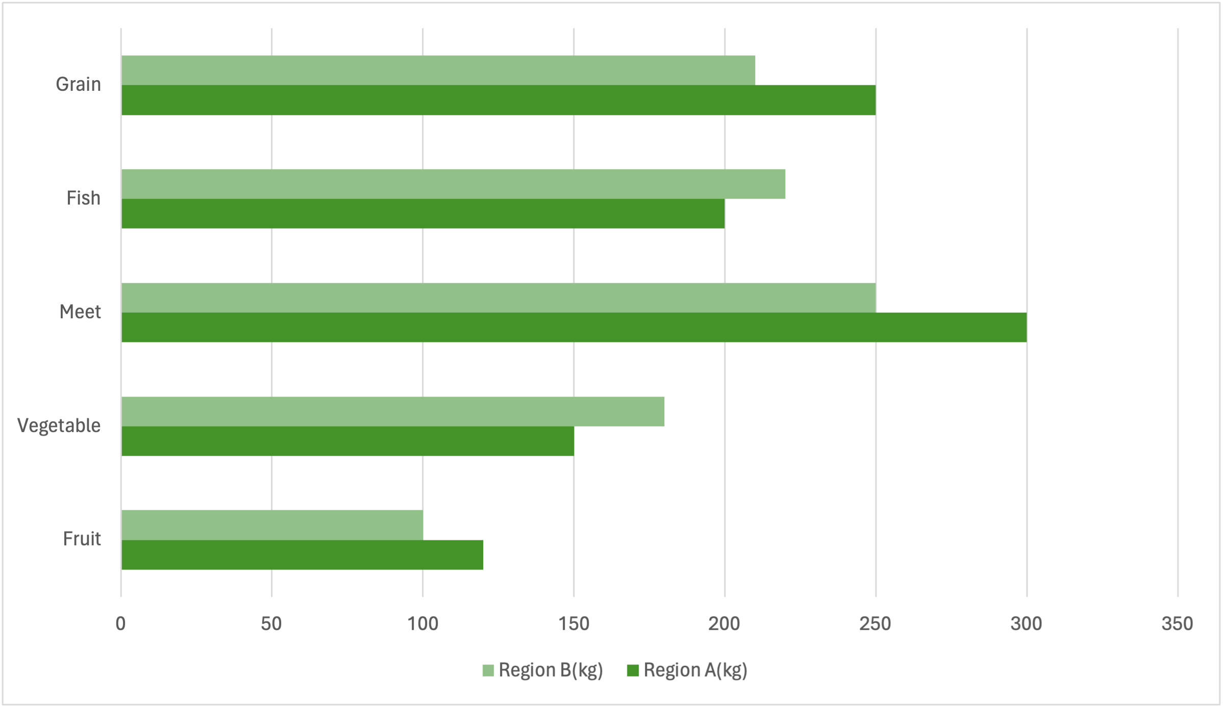
Clustered Horizontal Bar Chart
What is a Clustered Horizontal Bar Chart
-
A clustered horizontal bar chart is a type of bar chart used to compare multiple categories across different groups, similar to a clustered bar chart. However, in this chart, the bars are oriented horizontally instead of vertically. Each group is represented by a cluster of horizontal bars, with each bar representing a different category within that group. The chart typically has a vertical axis that lists the groups and a horizontal axis that displays the values.
-
The unique feature of a clustered horizontal bar chart is its horizontal orientation, which makes it particularly useful for comparing data with long category names or for displaying a large number of groups. This differs from traditional bar charts and clustered bar charts, which use vertical bars. The horizontal format makes it easier to read longer labels and view grouped data at a glance.
Applications of Clustered Horizontal Bar Charts
Employee Performance Analysis
- Clustered horizontal bar charts can be used to compare employee performance across departments. For example, a company might use this chart to compare the sales figures of different employees within each department. Each department is represented as a group, with the bars showing the performance of individual employees.
Marketing Campaign Effectiveness
- In marketing, clustered horizontal bar charts help visualize the effectiveness of campaigns across different channels or regions. For instance, a marketing team could use this chart to compare the reach and engagement of campaigns across various social media platforms, with each platform forming a group and bars representing different campaigns.
Customer Demographics Analysis
- Clustered horizontal bar charts are useful for analyzing customer demographics across various products or services. For example, a company could use this chart to compare the age distribution of customers for different products, with each product forming a group and bars representing different age groups.
Project Timeline Comparison
- In project management, clustered horizontal bar charts can illustrate the timelines of different projects. For instance, a project manager could use this chart to compare the durations of different project phases across multiple projects. Each project forms a group, with bars representing the timeline of each phase.
Clustered horizontal bar charts provide a clear way to compare data across multiple categories and groups, especially when long labels or numerous groups are involved. They offer a flexible and visually appealing way to present complex data sets.
