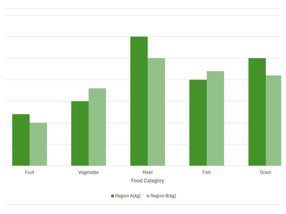
Simple Clustered Bar Chart
What is a Clustered Bar Chart
-
A clustered bar chart, also known as a grouped bar chart, is a type of bar chart used to compare multiple categories across different groups. In this chart, each group is represented by a cluster of bars, with each bar representing a different category within that group. The bars in each cluster are positioned side by side, allowing for direct comparison across groups. The chart typically has a horizontal axis that represents the categories and a vertical axis that shows the values.
-
The clustered bar chart differs from the traditional bar chart by grouping the bars together to provide detailed comparisons across multiple data sets. This makes it ideal for highlighting differences between groups in a single visualization. Unlike stacked bar charts, where bars are stacked to show cumulative totals, clustered bar charts show each category as a separate bar within the group, allowing for a clearer comparison.
Applications of Clustered Bar Charts
Product Sales Comparison
- Clustered bar charts are frequently used to compare product sales across different regions or time periods. For instance, a company might use a clustered bar chart to compare the quarterly sales of different product lines across several regions. Each region forms a group, with the bars representing the sales of each product line.
Academic Performance Analysis
- In the education sector, clustered bar charts can be used to analyze student performance across different subjects or academic terms. For example, a school might use this chart to compare student scores in mathematics, science, and language arts across multiple classes or grade levels, with each grade level forming a group.
Customer Satisfaction Surveys
- Clustered bar charts are useful for visualizing customer satisfaction survey results, comparing responses across different demographics. For example, a company could use a clustered bar chart to compare satisfaction levels between new and returning customers, with each customer type forming a group and bars representing different satisfaction criteria.
Budget Allocation Review
- In financial management, clustered bar charts can illustrate budget allocations across departments or projects. For instance, a company could use a clustered bar chart to compare budget allocations for various departments over different fiscal years. Each fiscal year forms a group, with bars representing the budget for each department.
Clustered bar charts are powerful tools for comparing multiple data sets across different categories, making them ideal for business, education, and financial analysis. Their ability to display complex data in a clear and concise format makes them invaluable for data-driven decision-making.
