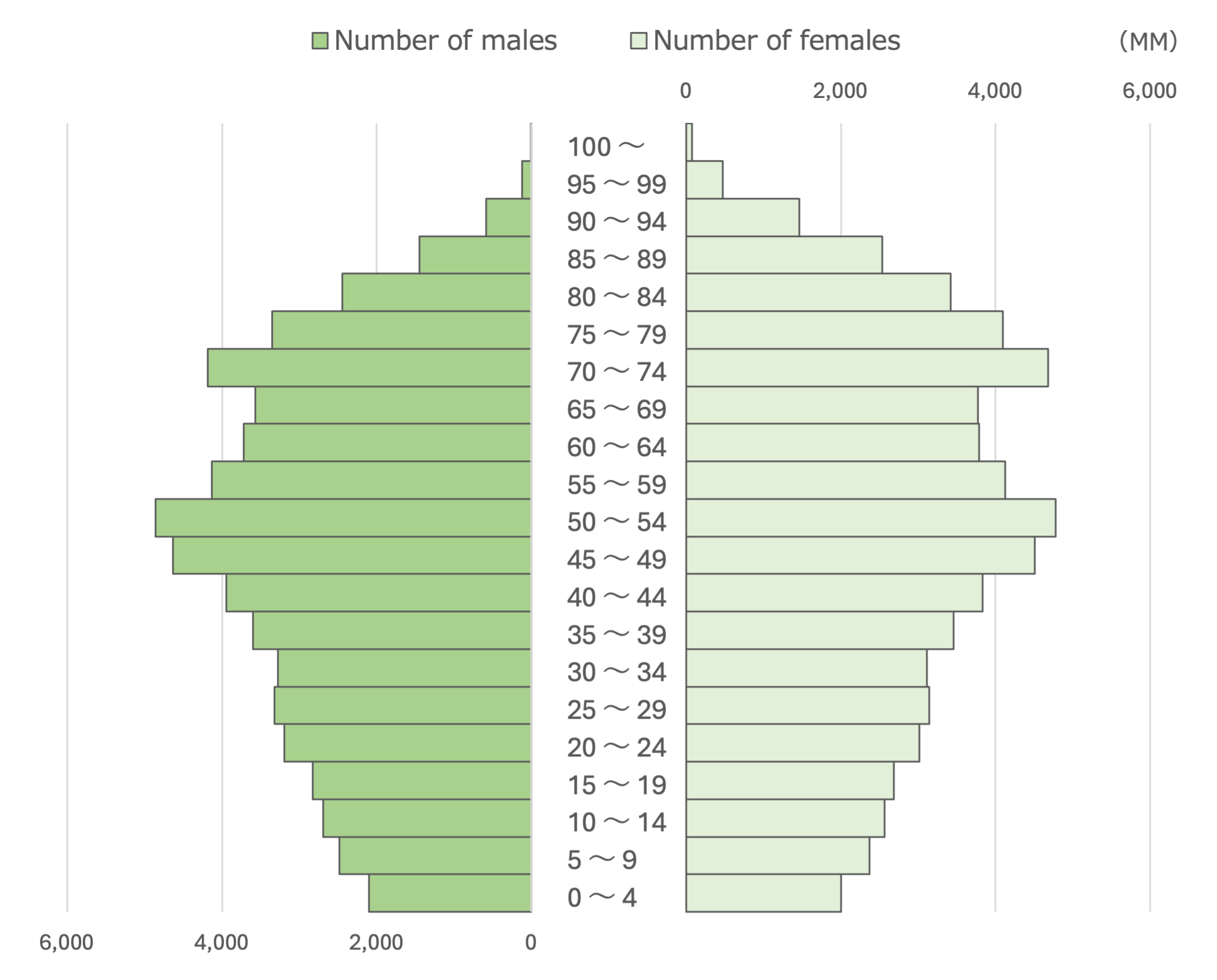
Butterfly Chart
What is a Butterfly Chart
-
A butterfly chart, also known as a tornado chart, is a data visualization tool used to compare two related sets of data side by side. Its distinctive structure resembles a butterfly with its wings spread, where the central axis represents categories, and the bars extending to either side depict values from two different data sets. The chart’s mirror-image format provides a direct comparison between the two sets of data.
-
The unique feature of a butterfly chart is its ability to simultaneously display data for easy comparison. Unlike traditional bar charts that present one set of data at a time, the butterfly chart aligns two opposite data sets for direct comparison. This makes it particularly useful for visualizing contrasts and differences in data.
Applications of Butterfly Charts
Demographic Analysis
- Butterfly charts are commonly used in demographic studies to compare age and gender distribution. For instance, a demographic report can use a butterfly chart to visualize the male and female population distribution across various age groups in a country.
Survey Data Comparison
- When analyzing survey data, butterfly charts can effectively compare responses between two distinct groups. For example, a company might use a butterfly chart to compare customer satisfaction scores between new and returning customers, revealing valuable insights into different customer segments.
Financial Performance Comparison
- Butterfly charts are useful in finance to compare performance metrics, such as revenues or expenses, across two different periods or entities. For instance, a financial analyst could use a butterfly chart to compare the profitability of two business units, highlighting differences in revenue and expense structures.
Policy Impact Assessment
- Governments and NGOs use butterfly charts to assess the impact of policies on different regions or populations. For example, a butterfly chart might compare the effects of a new policy on employment rates in urban and rural areas, showcasing the disparities in job growth.
Butterfly charts provide a powerful tool for comparative analysis in various fields by highlighting differences and similarities between two data sets.
